Why All the World Maps Are Wrong

Maps are often considered "wrong" due to the challenge of representing the three-dimensional Earth's surface on a two-dimensional plane. This leads to various types of distortion.
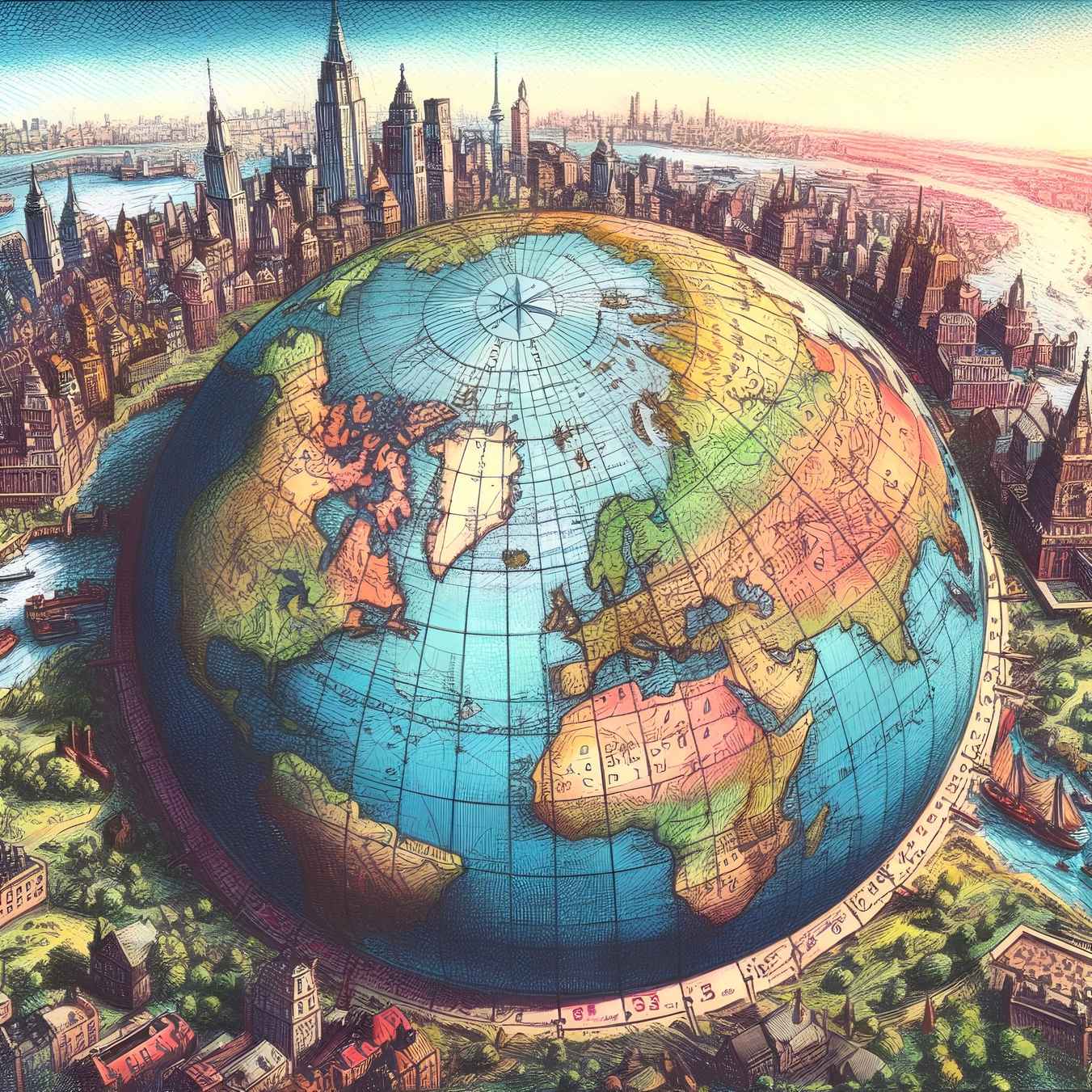
By Bertie Atkinson - Science & Biology Editor
mercator projection world maps
Image: malevus.com

If we were to ask you what the Earth looks like, you would likely think of the world map that we all know or a globe that we’ve been seeing since we were children. But in reality, only one of these representations is accurate. The classic world map below is the one you were taught at school and the default view on Google Maps. However, this world map does not accurately represent the true size of countries. It is based on the Mercator projection. For example, when you look at this world map, it seems like Africa and Greenland are nearly the same size, when in reality, the African continent is fourteen times larger than Greenland.

- Advertisement -

All World Maps Lie

Mercator projection of the Earth
Mercator projection of the Earth. Image: NASA.

In reality, the United States, Great Britain, France, Spain, Italy, Germany, all of Eastern Europe, India, China, and Japan could fit within the African continent.

So, why does this world map deceive us? The reason is simple: it’s a matter of geometry in space. The Earth is round, and it’s impossible to represent a sphere on a flat surface without distortion. All world maps are projections of different parts of the globe onto a flat surface, such as a cylinder. This means that all world maps distort reality.

Creating a world map is a choice, and making a world map is an expression of a viewpoint on the world. The world map is not the territory; it’s a way to create a highly convincing visualization of space.

One reason why this world map is still prevalent today is that it fairly well preserves the shapes of countries. For example, Brazil on Mercator’s world map is roughly the same shape as Brazil on a globe. However, if we go further back in time, the primary purpose of the world map was navigation.

Cartographer Gerard Mercator created this world map in 1569 to facilitate sea travel, trade, and colonization. Its design allowed for straight navigation routes that maintained angles, which was practical in an era when navigation relied on compasses. The problem with this world map is that the farther you move from the equator, the more areas are enlarged, which promotes a somewhat enlarged view of the world, especially for Westerners.

What Is the Mercator Projection, and What Kind of Distortion Does It Introduce?

The Mercator projection is a cylindrical map projection that preserves angles, making it useful for navigation. However, it introduces significant distortions in the sizes of land masses, particularly at high latitudes, making polar areas appear much larger than they are.

Why Would We Change the World Map?

América Invertida. Work of the Uruguayan painter Joaquín Torres García (1878-1949).
América Invertida. Work of the Uruguayan painter Joaquín Torres García (1878-1949).

Because Mercator’s world map projection encouraged European imperialistic attitudes for centuries and created an ethnic bias at the expense of the third world. For instance, Europe is depicted much larger than South America on this map, even though South America is nearly twice the size of Europe.

- Advertisement -

To sum it up, when creating a world map, you essentially choose the center of the world and project the globe around it.

The image above, showing Americans upside down, perfectly illustrates the inherent bias in world map creation. Uruguayan artist Joaquín Torres García called it “our north is the south” to illustrate that in Latin America and especially in the South, the center of the world is not quite the same as in Europe and the United States.

The Gall–Peters projection of the world map
The Gall–Peters projection of the world map. Image: Wikimedia.

To avoid giving their students a false view of the world, public schools in Boston decided to teach a different world map in 2017. It is the Gall-Peters projection, which the German historian Arno Peters popularized in the 1970s.

The Peters projection is an equal-area world map. It preserves area and takes into account the actual sizes of continents. However, it does not preserve angles and distorts distances, making it unsuitable for navigation. This world map respects proportions but less so the concept of distance. This raises questions about what the true scale of a world map is. 

- Advertisement -

The advantage of the Peters world map is that it equally and equitably distorts all parts of the world compared to the Earth’s spherical shape. As a result, Africa reclaims its enormity and dominance on the map. India is relatively stretched, and Russia is entirely transformed. This provides a rather unsettling view of the world compared to the familiar world map.

How Do Conformal Map Projections Differ From Equal-Area Projections?

Conformal map projections preserve angles and shapes, making them suitable for navigation and drawing accurate maps of coastlines. Equal-area projections, on the other hand, maintain the relative sizes of areas, which is important for studies of geography and demographics.

Today We Have an Even More Realistic World Map

AuthaGraph projection Hajime Narukawa
AuthaGraph projection.

Architect Hajime Narukawa (AuthaGraph projection) proposed the world map based on a 1946 map, the Fuller projection (Dymaxion map or Fuller map). The idea behind this world map is to replicate Fuller’s map but in rectangular form.

The world on a Dymaxion projection, with 15° graticule.

The world on a Dymaxion projection, with 15° graticule.

To achieve this shape, Narukawa divided the globe into 96 triangles to create a tetrahedron, a kind of rectangular pyramid. He then unfolded it to create a rectangle. The result is a world map that best respects the proportions between continents and preserves their shapes. This world map also allows us to grasp the size of our oceans, which become more significant when Earth’s true size is restored.

Changing our perspective on the expanse of our lands could change our relationships with others, other continents, and nature itself, which would not be a luxury. So, should we ban the Mercator projection from our classrooms? In any case, we should teach all the other world maps on an equal footing with this one and remind people that none of them are exactly correct.

- Advertisement -